Introduction.
In Microsoft Access, the ListBox control is often used to display a few columns of data, making it easy to locate and select items. Its data source may be entered directly into the Row Source property as a value list, or it can be loaded dynamically from a table or query.
The ComboBox control, by contrast, keeps its list hidden until the user clicks to expand it and make a selection. Both of these are standard Access controls on forms.
There is also another familiar list-style control that we encounter frequently in Access: the Datasheet View. Whether records are displayed from a table or query, the datasheet presents them as a large, scrollable list in tabular form.
In addition to these built-in controls, Microsoft Access also allows us to use ActiveX controls. A common example is the Microsoft Common Dialog Control (often used for file browsing).
The focus of this topic, however, is the Windows ListView control. You can think of it as very similar to Windows Explorer: it can display items as large icons, small icons, a simple list, or in a detailed view with multiple columns. Data from an Access table or query can be loaded into the ListView, giving you the ability to:
-
Rearrange columns or rows,
-
Sort items interactively,
-
Display images next to items,
-
Present records in a more flexible, customizable layout.
This control is widely used in other programming environments such as VB6, VB.NET, and C#. In this article, we will explore how it can be integrated into a Microsoft Access database.
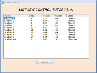
Below is a simple ListView demo screen displaying sample data:
We will use the image-like display shown earlier as the starting point for this ListView Control tutorial. With just a few lines of VBA code, we have uploaded ten rows of data into the ListView control.
By default, the ListView ActiveX control may not appear in the list of available ActiveX controls in Access. To make it available, we must add its library file, MSCOMCTL.OCX, from the C:\Windows\System32 folder to the Access references. Once registered, you will see it listed as Microsoft ListView Control, Version 6.0, along with other ActiveX controls.
This library file provides several useful controls, including ListView, TreeView, and ImageList. If you have already followed our earlier TreeView control tutorials, you are familiar with this library.
Adding the Windows Common Controls Library (MSCOMCTL.OCX)
Follow these steps to attach the MSCOMCTL.OCX file to your database:
-
Open your database and press Alt + F11 to launch the VBA editor.
-
From the Tools menu, select References…
-
Click the Browse button.
-
Locate the file MSCOMCTL.OCX (Microsoft Windows Common Controls) in one of the following folders:
-
C:\Windows\System32\→ on 32-bit systems, or on most Windows 11 installations. -
C:\Windows\SysWOW64\→ on 64-bit systems.
-
-
Select the file and click Open to attach it to your database.
-
Press Alt + F11 again to return to the database window.
Designing a Sample Form with the ListView Control
We will now design a simple form that matches the sample image shown at the beginning of this tutorial.
-
Create a new blank form in Design View.
-
From the Controls group, select ActiveX Control.
-
In the list of available ActiveX controls, locate and select Microsoft ListView Control, Version 6.0, then click OK to insert it onto the form’s Detail section.
-
Resize the control:
-
Grab the bottom-right resize handle and drag it outward to make the ListView large enough to resemble the sample image.
-
Move the control slightly down and to the right to leave space for a heading label above and some margin on the left.
-
-
With the ListView still selected, open the Property Sheet and rename the control by setting its Name property to: ListView1
-
Create a Label control above the ListView.
-
Change its Caption property to: ListView Control Tutorial
-
Apply any formatting you prefer (font size, bold, color, etc.) to make the heading stand out.
-
-
Insert a Command Button below the ListView.
-
Set its Name property to: cmdClose
-
Set its Caption property to: Close
-
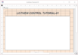
When completed, your form design should look similar to the following layout:
Now, save the Form with the name: ListViewTutorial and keep the Form in the design view.
Press Alt+F11 to go back to the Form’s Class Module Window.
The VBA Code.
Copy and paste the following Code into the Form's VBA Module, replacing existing lines of code, if any:
Option Compare Database
Option Explicit

Dim lvwList As MSComctlLib.ListView
Dim lvwItem As MSComctlLib.ListItem
Dim ObjImgList As MSComctlLib.ImageList
Const prfx As String = "X"

Private Sub cmdClose_Click()
   DoCmd.Close acForm, Me.Name
End Sub

Private Sub Form_Load()
    Call LoadListView
End Sub

Private Function LoadListView()
    Dim intCounter As Integer
    Dim strKey As String

'Assign ListView Control on Form to lvwList Object
 Set lvwList = Me.ListView1.Object

 'Create Column Headers for ListView
 With lvwList
    .ColumnHeaders.Clear 'initialize header area
   'Parameter List:
'Syntax: .ColumnHeaders.Add Index, Key, Text, Width, Alignment, Icon
    .ColumnHeaders.Add , , "Name", 2500
    .ColumnHeaders.Add , , "Age", 1200
    .ColumnHeaders.Add , , "Height", 1200
    .ColumnHeaders.Add , , "weight", 1200
    .ColumnHeaders.Add , , "Class", 1200
 End With

 'Initialize ListView Control
  While lvwList.ListItems.Count > 0
        lvwList.ListItems.Remove (1)
  Wend

 With lvwList
    For intCounter = 1 To 10
        strKey = prfx & CStr(intCounter) '
   'Syntax: .ListItems.Add(Index, Key, Text, Icon, SmallIcon)
        Set lvwItem = .ListItems.Add(, strKey, "Student " & intCounter)
        'Add next columns of data as sub-items of ListItem
        With lvwItem
      'Parameters =      .Add Index,Key,Text,Report Icon,TooltipText
            .ListSubItems.Add , strKey & CStr(intCounter), CStr(5 + intCounter)
            .ListSubItems.Add , strKey & CStr(intCounter + 1), CStr(135 + intCounter)
            .ListSubItems.Add , strKey & CStr(intCounter + 2), CStr(40 + intCounter)
            .ListSubItems.Add , strKey & CStr(intCounter + 3), ("Class:" & intCounter)

       End With
    Next
    'reset lvwItem object
    Set lvwItem = Nothing
End With
lvwList.Refresh

End Function
Save the Form with the name ListView Control Tutorial-01.
Demo View of the Form.
Open the Form in Normal View to have a look at our creation.
If you find your form with the following image-like display, then you are on the right track.
We need to make some adjustments to the ListView control’s property settings. Earlier, we renamed the control to ListView1 using the standard Access Property Sheet. However, the ListView control has its own dedicated property sheet, which provides more detailed configuration options. Some of these settings also appear in the Access Property Sheet, but many are unique to the control itself.
To access it, right-click the ListView control, point to ListViewCtrl Object, and then select Properties from the shortcut menu.
This will open the ListView control’s own property sheet, as shown in the image below:
At the top of the Property Sheet, you will see tabs that group various options. By default, the General tab is active. On this tab, the left side lists option values, while the right side contains corresponding checkboxes.
For our form, we only need to adjust two ListView properties, which are disabled by default. Once enabled, these allow the ListView to display in different modes—such as large icons, small icons, simple lists, or Report View (as shown in the first image above).
-
Check the Enabled property on the right side to activate the ListView control.
-
From the View drop-down list on the left side, select lvwReport.
-
Click the Apply button to confirm the change.
-
Click OK to close the Property Sheet.
Finally, save the form and open it in Normal View. The result should now look like the image shown earlier, except for any differences in form background color or other form-level settings.
-
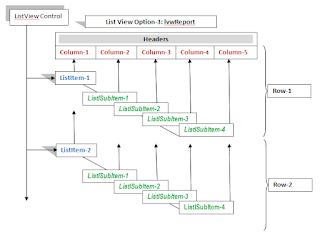
In the diagram, the box at the top-left corner represents the ListView control.
The first step in preparing the list is to create the column headings. These headings (shown in red in the diagram) work the same way as field headers in a table’s Datasheet View. Each column heading is added to the ColumnHeaders collection of the ListView control using the
ColumnHeaders.Add()method. Since our sample has five columns, the method is called five times, once for each heading.The next set of actions loads the actual data. Each row of data represents a single record with five fields. However, these fields are not loaded all at once—they are split between two different object members of the ListView control: ListItems and ListSubItems.
-
The first field value (the value for the first column) is added to the ListItems collection using the
ListItems.Addmethod. For example, in the sample image, the value Student1 (from the first column of the first row) is stored in theListItemsobject. -
From the second column onward, the remaining field values are added as ListSubItems of the corresponding ListItem. This is done using the
ListSubItems.Addmethod, called four times—once each for the Age, Height, Weight, and Class values.
Together, these two steps complete a single row of data in the ListView control. The diagram illustrates this process with two rows of sample data.
Once you understand this two-level structure—ListItems for the first column, ListSubItems for the remaining fields—the VBA code that builds the ListView will be much easier to follow.
-
-
Open the demo form once and then close it.
-
Reopen the form in Design View.
-
Right-click the ListView control, highlight the ListViewCtrl Object option, and select Properties from the menu.
-
In the property sheet, go to the Column Headers tab.
-
You will see the first column heading displayed in a text box, with its Index value (1) shown above.
-
Move the mouse pointer to the right side of the index number box. Arrow buttons (left and right) will appear.
-
Click the right arrow to scroll through and display the remaining column labels, one by one, as their index numbers change.
-
If you open and close the form again, you will notice that the Column Headers tab now contains duplicate sets of the same column labels.
- Microsoft TreeView Control Tutorial
- Creating an Access Menu with a TreeView Control
- Assigning Images to TreeView Nodes
- Assigning Images to TreeView Nodes-2
- TreeView Control Checkmark Add Delete
- TreeView ImageCombo Drop-down Access
- Re-arrange TreeView Nodes By Drag and Drop
- ListView Control with MS-Access TreeView
- ListView Control Drag Drop Events
- TreeView Control With Sub-Forms
The Program's Functional Diagram.
Before diving into the VBA code, it’s important to understand how data items are actually loaded into the ListView control. With a ListBox, the data arrangement is fairly straightforward. However, the ListView control uses a completely different approach. The loading process does not follow the logical sequence we might naturally expect.
Once you see how the data flows from the source into a single row—illustrated as a diagram or flow chart—the concept becomes much easier to grasp. With this visual in mind, understanding the VBA code and its role in the process will be far more intuitive.
The Data Flow Diagram.
Let us go to the VBA Code Segment-wise.
In the global declaration section of the module, we have declared the ListView object, the ListItem object, the ImageList object, and a constant variable with the string value "LV".
Dim lvwList As MSComctlLib.ListView
Dim lvwItem As MSComctlLib.ListItem
Dim ObjImgList As MSComctlLib.ImageList
Const prfx As String = "X"
The variable lvwList is declared as a ListView object, lvwItem as a ListItem object of the ListView control, and ObjImgList as an ImageList object. The ImageList object is another ActiveX control that can store image icons for use with both the TreeView and ListView controls. For now, we will set the ImageList aside and return to it later.
The constant Prfx is used as the Key value prefix in the ListItems.Add method, which accepts several optional parameters. The Key value must always be a string type.
The LoadListView() function serves as the main program.
On our form, the ListView control is named ListView1. The first executable statement in the program is:
Set lvwList = Me.ListView1.Object
Assigns the ListView1 control on the Form into the Object variable lvwList declared in the Global declarations area.
Next, we will get prepared to load the Column Header information. First, we initialize the ColumnHeader object to ensure that it is empty. When we repeatedly run the program, the control has a tendency to retain the earlier loaded values in the control. When you open and close this form more than once, after disabling the 'ColumnHeaders.Clear' statement, you will know the difference. The same set of headings is added to the control every time and will appear in the control with empty rows below.
You can verify this behavior manually with the following steps:
lvwList.ColumnHeaders.Add(Index, Key, Text, Width, Alignment, Icon)
All parameters are optional.
With lvwList
    .ColumnHeaders.Clear 'initialize header area
'Parameter List:
'Syntax: .ColumnHeaders.Add Index, Key, Text, Width, Alignment, Icon
    .ColumnHeaders.Add , , "Name", 2500
    .ColumnHeaders.Add , , "Age", 1200
    .ColumnHeaders.Add , , "Height", 1200
    .ColumnHeaders.Add , , "weight", 1200
    .ColumnHeaders.Add , , "Class", 1200
 End With
The Index value is automatically assigned as running serial numbers (1, 2, 3, and so on).
The Key value is of the String data type. Although it is not typically used for column headers, it can be assigned if needed.
The Text value is what appears on the control as the column label.
To control the display width of each column, you can assign an approximate width value in pixels, based on the data expected under that column.
If the Text alignment property is omitted, the default is Left alignment (0 - lvwAlignmentLeft). Alternatively, you can set it to Right alignment (1 - lvwAlignmentRight) or Center alignment (2 - lvwAlignmentCenter).
Once the column headings are loaded, the next step is to insert the first record. Specifically, we start by loading the first column value of the first row. But before doing so, we must initialize the ListItems object with the following code segment:
'Initialize ListView Control
  While lvwList.ListItems.Count > 0
        lvwList.ListItems.Remove (1)
  Wend
The next code block loads the record list items one row at a time, generating a total of ten rows with sample values. For demonstration purposes, these values remain mostly constant, with a few variations to highlight the process. This is accomplished by placing the logic inside a For...Next loop, which iterates ten times, thereby creating ten rows of data in the ListView control.
With lvwList
    For intCounter = 1 To 10
        strKey = prfx & CStr(intCounter) '
  'Syntax: .ListItems.Add(Index, Key, Text, Icon, SmallIcon)
        Set lvwItem = .ListItems.Add(, strKey, "Student " & intCounter)

  'Add next columns of data as sub-items of ListItem
        With lvwItem
  ' Syntax: .ListSubItems.Add Index,Key,Text,Report Icon,TooltipText
            .ListSubItems.Add , strKey & CStr(intCounter), CStr(5 + intCounter)
            .ListSubItems.Add , strKey & CStr(intCounter + 1), CStr(135 + intCounter)
            .ListSubItems.Add , strKey & CStr(intCounter + 2), CStr(40 + intCounter)
            .ListSubItems.Add , strKey & CStr(intCounter + 3), ("Class:" & intCounter)

       End With
    Next
    'reset lvwItem object
    Set lvwItem = Nothing
End With
The first statement inside the For...Next loop —
— prepares a unique Key value for the first list item (the first column).
All parameters of the ListItems.Add() Methods are optional. However, in this case, the first three—Index, Key, and Text—are used in the same sequence as the Column Headers. The remaining two parameters are reserved for assigning an icon and a small icon image, if needed.
When the value for the first column of a row is assigned to the ListItem (i.e., lvwList.ListItems), that object reference is stored in the lvwItem variable. This allows easy access to its sub-object, ListSubItems, without having to repeatedly write the full object reference.
lvwList.ListItems.Item(index).ListSubItems.Add()
Expressed in the short form with lvwItem.ListSubItems.Add()
Using the short form 'lvwItem.ListSubItems.Add()' We can load the remaining column values into the ListView control.
The ListSubItems.Add() method accepts its first three parameters in the same order as the ListItem (Index, Key, and Text), followed by the optional Icon image reference and Tooltip Text.
For the Key value of each column, I have appended the current loop counter value plus an offset to ensure uniqueness across all columns. Although the Key parameter can be omitted, it is good practice to use it.
The Method ListSubItems.Add() is called four times within the loop to insert values for the second through fifth columns.
These steps repeat nine more times, ultimately creating ten sample records in the ListView control.
The demo database containing this ListView control example is attached, ready to run and explore.
In the next part of this tutorial, we will explore how to search and locate specific values within the ListView control, as well as how to rearrange columns—just like we do in Datasheet View.


this is Excellent work , real object library
ReplyDeleteHow do you set the width of columns? When I do
ReplyDeleteWith lvxObj.ColumnHeaders.width. I receive an error.,